15 Ways to Make Your Résumé Uber-Créativé
SPOT MORE COOL STUFF:
Print Design | 10 Comments
| All Design Reviews
The point of a resume isn’t to get you hired. It is to get you noticed and invited for an interview so then you can get hired.
Here’s a look at 15 eye-catching types of resumes that are certain to get you noticed. Some may inspire you to get more creative with your own resume. Others maybe not so much.
Click on any below resume to learn more:
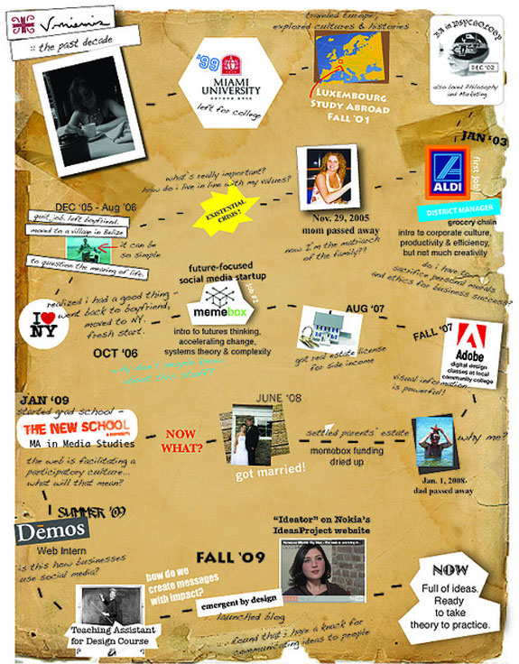
Infographic
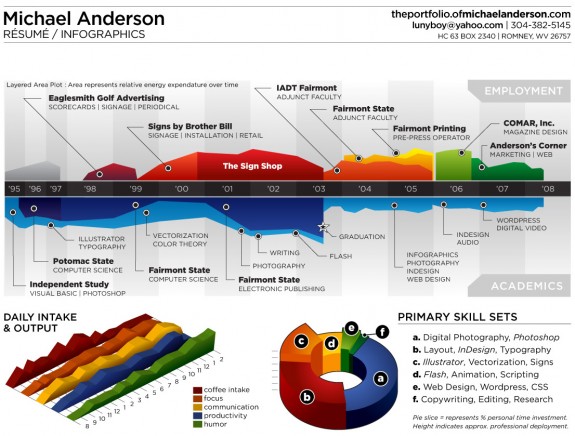
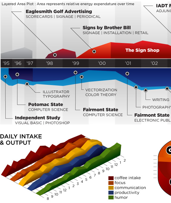
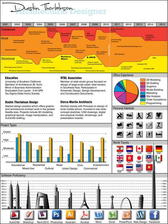
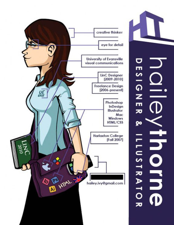
The infographic is one of the most professional yet stunning of the “alternative” resume formats. One of our favorites is from Michael Anderson. He’s injected some humor into his resume but also a bundle of useful knowledge—the more you look at it the more you see.
The majority of infographic resumes include a timeline. But much of what you might want to impart in a resume, like proficiency in various software programs, can be displayed visually. Here’s a great example:
T-Shirt
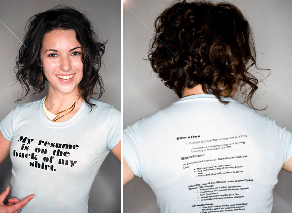
Want to conduct your job search while walking down the street or standing in line at the store? We suppose that’s the idea behind the resume t-shirt. The shirt shown below was printed at Blackbird. Another good site to custom print shirts (and bags and much else) is CafePress. If you opt to t-shirt-ize your resume we suggest maybe having an old fashion paper version available as well.
On Fabric
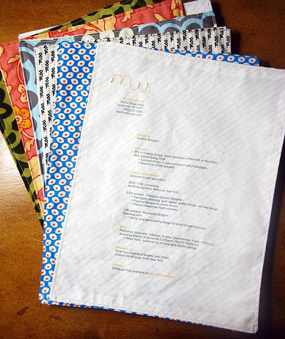
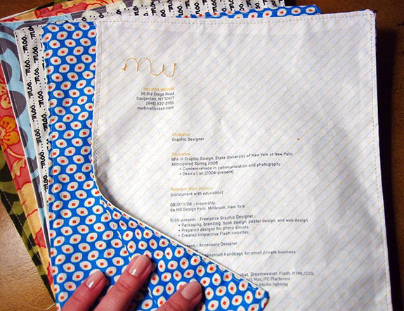
The resumes below are printed on iron-on paper and transferred to fabric. Then sewn-on elements were added. Designed by Melissa Makes Things.
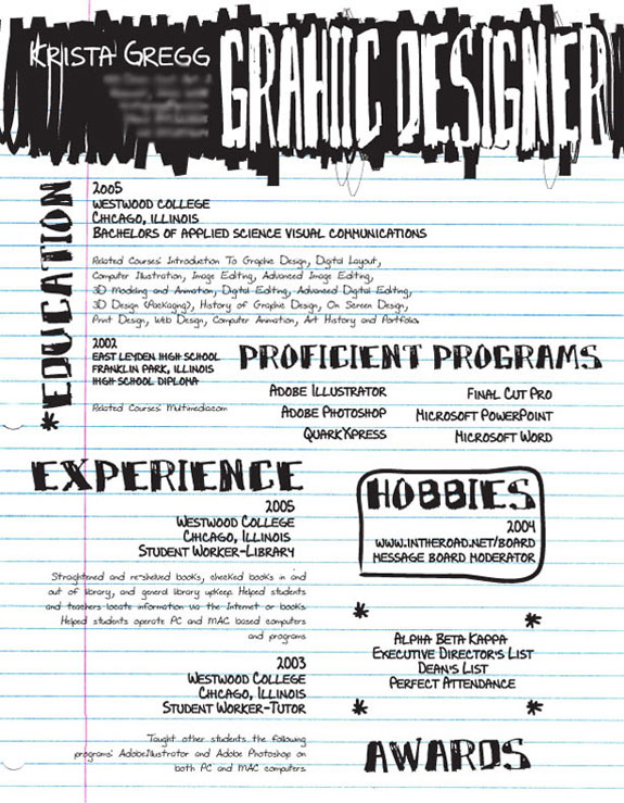
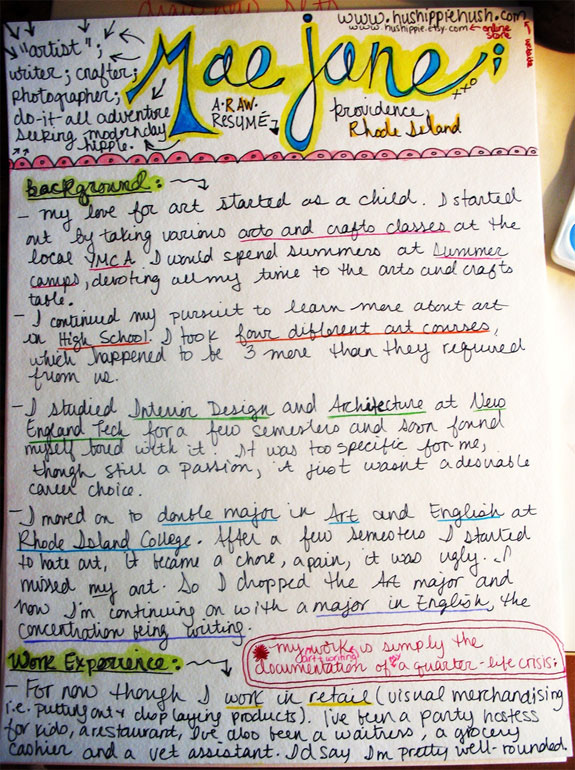
Pen & Ink
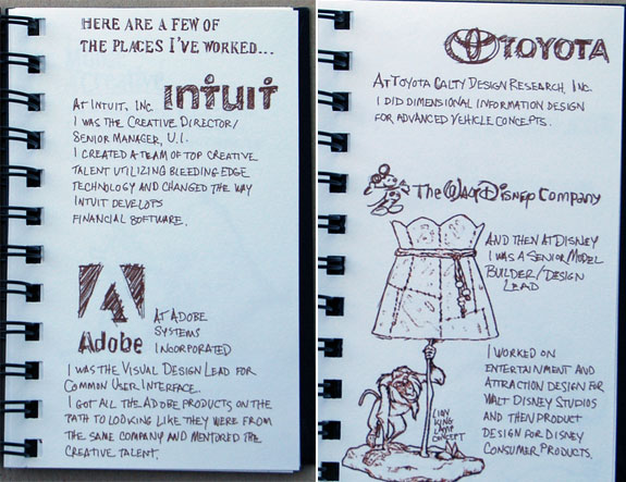
Handwriting a resume can add a wonderful personal touch. Though there’s a fine line between a handwritten resume that looks professional (the first below, perhaps) and one that looks like it was randomly put together during arts & crafts hour (like the second one?).
Notebook
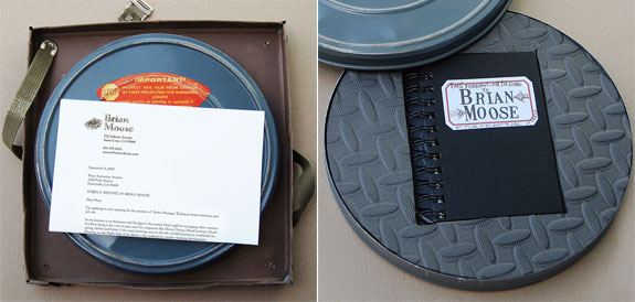
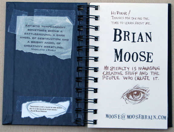
Common wisdom has it that you should send out resumes to as many potential jobs as you can. But sometimes it is best to go all out for that one job you want. That’s what Brian Moose did when he applied for a position at Pixar. He wrote a 13-page notebook describing his experience and job skills and then sent it off encased in an old film reel container. We don’t know if he got the job. But if you are a manager at Pixar how could you not at least give this guy an interview?
Photography
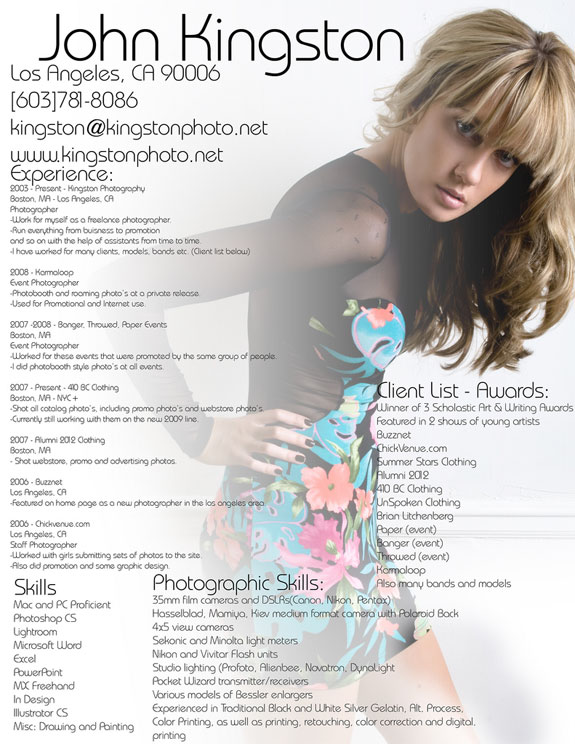
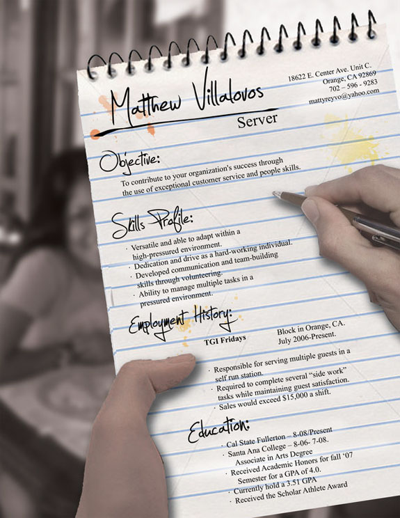
A background photograph is one of the easiest ways to add flare to your resume—if it is a good photo. Here are two that incorporated photography particularly well:
Not incidentally, iStockphoto is a great site for finding high quality, royalty-free images.
3D
Adding another dimension to your resume can help it rise above the others. The key is making a 3D resume that can also lay flat—so that it can more easily be mailed and photocopied. A cool example:
Collage
We love this collage-style resume, especially for an entry level position. But make sure yours is still readable after it is photocopied in black & white.
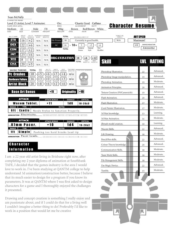
D&D Character
You have to be quite the geek—and hope your hiring manager is too—to send off a resume that resembles a Dungeons & Dragons character sheet. Not everyone wants to hire a level 15 artist-Orc with 98 hit points and an 18-point saving throw that can fend off PC crashes.
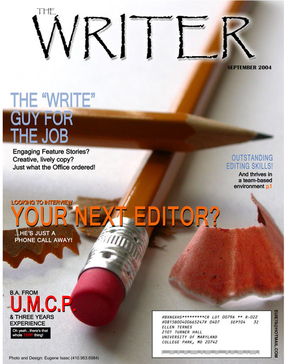
Magazine Cover
There’s little information on this magazine cover. But it could be effective in combination with a more traditional resume.
Spoofing the cover of Guns & Ammo magazine when applying for a job? Not so recommended.
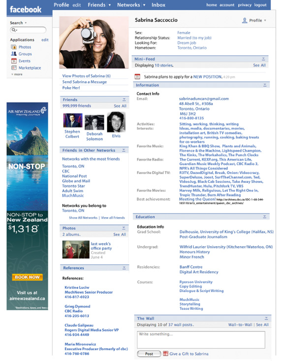
This resume’s strength and weakness: It looks like a Facebook page. We’d like to see the ad space used to further the job seeker instead of Air New Zealand. The full resume is two pages—click here to download the entire PDF.
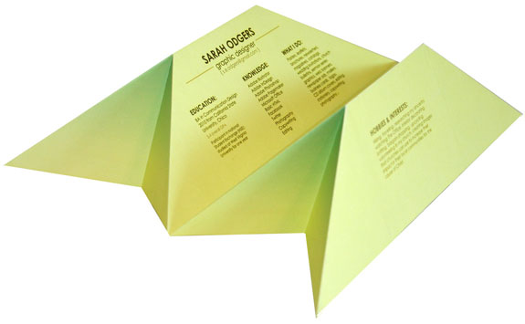
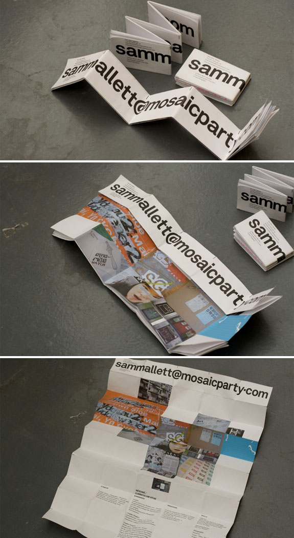
Folding Resume
This resume looks cooler to us when folded up than it does when open. That’s a huge downside when considering using this style yourself.
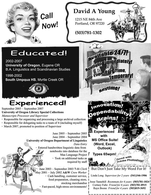
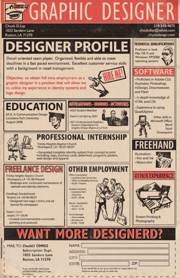
Retro
This is not a resume style one would use applying for a high tech job, but for a certain type of position it could work wonders. The lesson: The artistic look of your resume such match the job you are applying for.
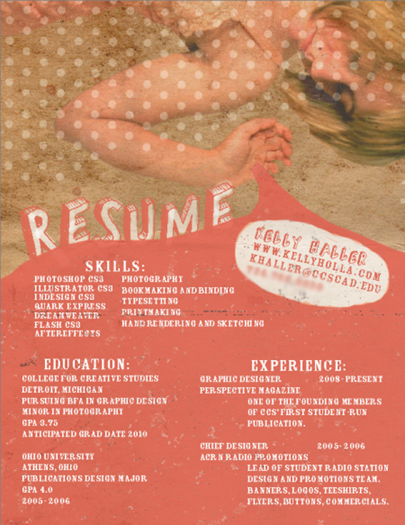
Artistic
We’d argue that every resume—even a standard text resume—has an artistic look. These two below are especially artistic. Note: Unless you have some serious design game do not use this resume style yourself.
Card Set
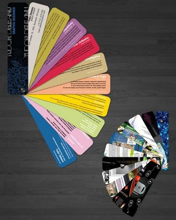
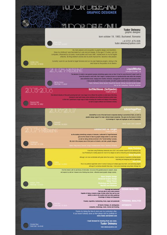
Here’s a creative resume type anybody can put together with some effort. Print out the various portions of your resume on Moo cards and then combine those into a card set.
 PRINT RESUMES | JOIN US ON TWITTER / FACEBOOK
Related posts:
Websites for Printing Cool, Creative Business Cards — For Cheap!
Cool Websites For Finding Blogging Jobs
Self-Publish Your Own Magazine
Airwear: Airport Codes As Cool Fashion
5 Cool Photoblogs
Elsewhere on the web:




April 26th, 2012at 8:42 am(#)
Twitter: grebenmjgmail.com
wow, really wondering if brian moose had that job at pixar
[Reply to this comment]
March 13th, 2012at 1:26 pm(#)
I really love the Photography ones. I think this would be an awesome way for a model to get noticed. I mean of course you’re gonna have to send in a portfolio but still.
[Reply to this comment]
January 25th, 2012at 8:17 am(#)
What an interesting an creative post! I love it! I always think how important is to have your information presented on the unique way and hence to stand out from the crowd. With your tips and some tricks I’ve learned from webinars organized by http://www.blog.ivyexec.com I’m sure my resume will eye catching! Thanks again!
[Reply to this comment]
March 4th, 2011at 9:12 pm(#)
Did anyone notice that Krista Gregg spelled “Graphic” wrong?

[Reply to this comment]
January 26th, 2011at 6:40 pm(#)
Villalovos made one crucial error – either correctly clone out the watermark from the stock site you’re stealing from, or even better – PAY for the stock photography you are using!! Bad form, but great look!
[Reply to this comment]
November 4th, 2010at 11:34 am(#)
I’m not sure I agree with this general approach–it’s right up there with way-over-produced business cards. There’s a continuum that goes from boring to bland to nice to great to exceptional to douchebag. Too many of these crossed the line, even at the concept stage. Yes, you need to get attention, but in many cases, well-played whispers of skills, experience and capabilities work far better than clever attention-grabbing gimmicks.
[Reply to this comment]
October 22nd, 2010at 1:09 am(#)
LV & SpotCool: Precisely what I was thinking: “Well, these are fantastic if you happen to be a graphic designer, but for me, not so much.”
[Reply to this comment]
October 20th, 2010at 10:45 am(#)
Jasper – Thanks
LV – Agreed. The resume has to be tailored to the job and to the employer. Taking an example from above, Pixar would be more open to a creative resume for a management job than, say, Goldman Sachs.
[Reply to this comment]
October 19th, 2010at 8:00 am(#)
nice stuff but if you’re going for any business or management consulting job – these cute resumes are in the bin stat. take it as a word of advice perhaps
[Reply to this comment]
October 6th, 2010at 10:52 am(#)
Very creative and timely advice here, given the number of job seekers chasing few jobs, you gotta stand out in some way to increase your chances – and if ever there was a time to have to take chances, it is in this job market…
Kudos Cool Stuff!
[Reply to this comment]